ESRI Tapestry Segmentation

For the last 20 years, ESRI has been capturing geographic and demographic data. In the 90’s Acxiom (and others) came up with Lifestyle Segmentation. ESRI started in 1969 and today maps “everything” down to the household level.

I’m surprised by the accuracy of Tapestry Segmentation. The top three segments in my zip code are: “Top Tier”, “Comfortable Empty Nesters” and “In Style”. Pretty accurate – with one data point. I’m an Empty Nester who would like to be “In Style” or “Top Tier” but feel very lucky and fortunate to be “comfortable”.
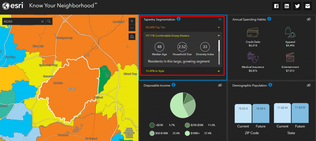
The 45243 Zip Code

Here is a link to a PDF with more on Tapestry Segmentation and my personal segment.
Just in case you we’re interested here are the details on “Top Tier” and ‘In Style“.
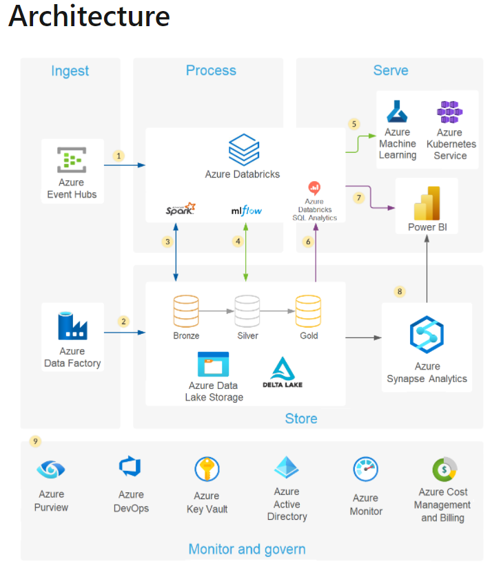
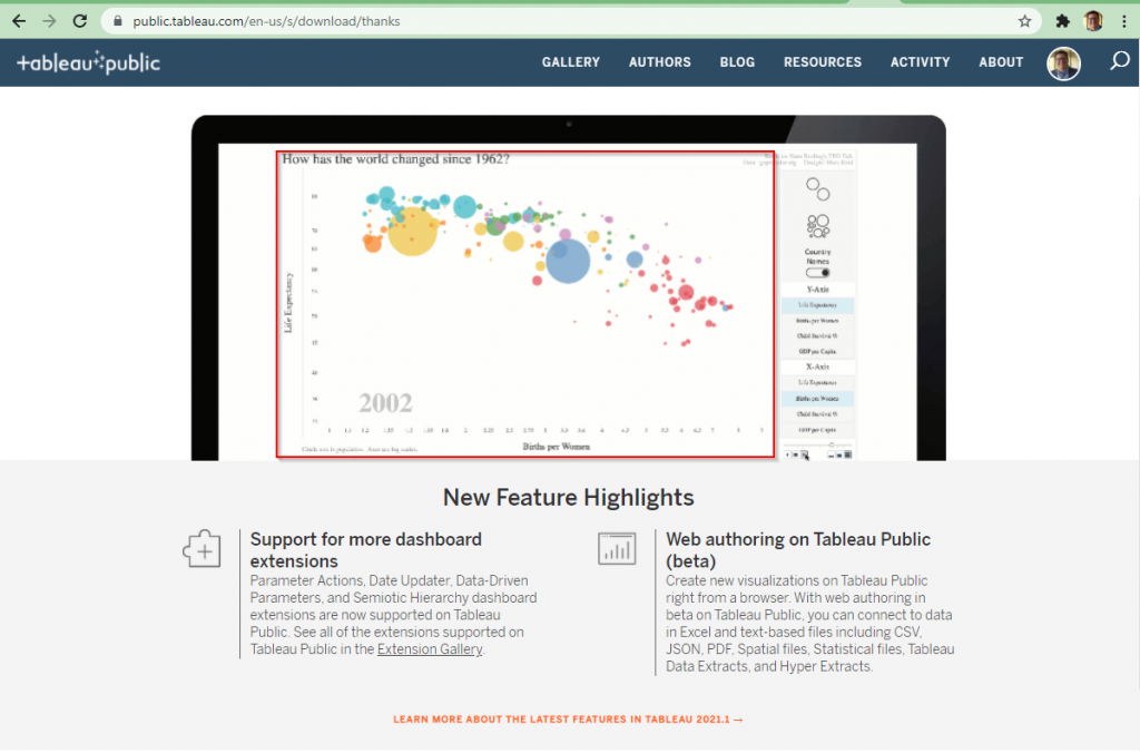
15 Years since Hans Rosling first excited the world!

Classic Hans Rosling Bubble Chart – on main Tableau page!

I had a chance to take a look today at Tableau Public. I’ve used it in the past but to be honest Tableau is my third favorite visualization tool (behind Qlik and Power BI). I was impressed to see they used an example mimicking the famous TED talk by Hans Rosling. If you haven’t seen this and you’re interested in data and analytics – its a must watch! 🙂

Nathan Yau’s Reading List

I follow and really like Nathan Yau. His site FlowingData.com is a great resource for Data Visualization inspiration. Below is his reading list for during the crisis:

Making Charts

Books specifically about making and using charts…

Statistics

Making sense of numbers…

Development

Some code…

  • R Packages by Hadley Wickham — I know the basics, but I should know more.
  • The Book of R by Tilman M. Davies — A big, fat reference.
  • Some visualization with Python book. I’ve seen some books, but is there a well-regarded reference?

Design

Outside visualization, but applicable…

Inspiration

To think about various visual forms…