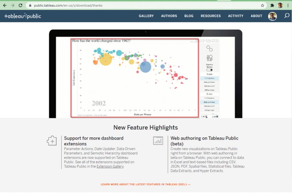
I had a chance to take a look today at Tableau Public. I’ve used it in the past but to be honest Tableau is my third favorite visualization tool (behind Qlik and Power BI). I was impressed to see they used an example mimicking the famous TED talk by Hans Rosling. If you haven’t seen this and you’re interested in data and analytics – its a must watch! 🙂