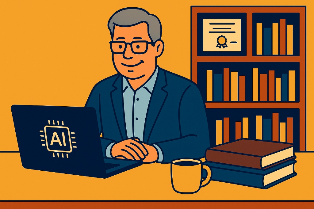
Here’s how I’ve always approached learning new technology
I’m sharing my approach here: https://www.thinkdashboards.com/learn-ai/
TL;DR – Starting in mid-80’s with mainframes, minicomputers, and VAX systems, I’ve seen continuous technological change—from early networking and the rise of the internet in the 1990s, through client/server and web development, into data warehousing and the modern BI stack in the 2000s. The 2010s brought self-service analytics, in-memory computing, and Power BI, followed by cloud transformation. Most recently, the rapid rise of generative and agentic AI (2022–present) represents yet another huge shift in how technology is built and used. The one constant has been the need to always be curious and constantly learning.
Today is no different. To learn anything you need to play, practice, discover and build! I’m approaching AI the same way I approached my first spreadsheet – Lotus 123! I had a huge big black book (heavy and hundreds of pages) to look up functions and how to format macros – but the learn learning came from using the tool to solve homework and basic business problems. In graduate school it was the same thing – we had access to SAS and SPSS with huge books and learning materials – but the real learning always came from having to actually use the software.
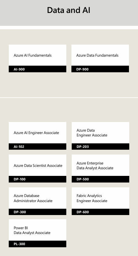
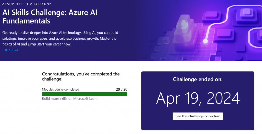
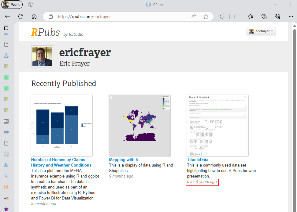
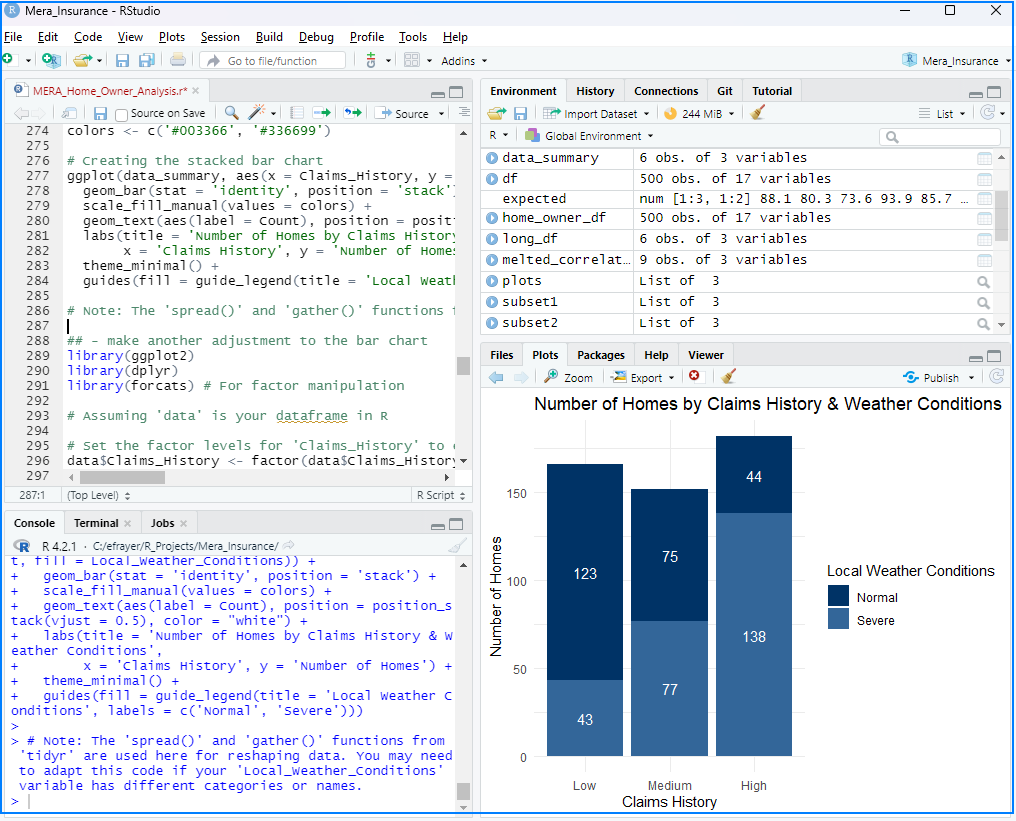
So I’m putting together a set of exercises and instructions for practical and applied AI. For more information and the follow along please visit: https://www.thinkdashboards.com/learn-ai/
Career Timeline of Continuous Technology Change (Starting 1985)
- Late 1980s (1987–1989) – Mainframes, minicomputers, and VAX systems
- Early 1990s (1990–1994) – BITNET, early internet, and punch card/statistical processing fading out
- Mid–Late 1990s (1995–1999) – Client/server computing and the rise of web development
- Early 2000s (2000–2002) – Dot-com boom and collapse; Kimball vs. Inmon data warehousing approaches
- Mid 2000s (2003–2007) – 64-bit server adoption and emergence of the Microsoft BI stack (SSAS, SSIS, SSRS, MDX, BIDS)
- Late 2000s–Early 2010s (2008–2013) – Self-service BI begins (Qlik, Tableau) and early in-memory analytics
- Mid 2010s (2014–2017) – Power BI, DAX, and modern data modeling
- Late 2010s–Early 2020s (2018–2022) – Cloud computing reshapes architecture (cloud vs. on-premise)
- Early AI Wave (2022–2023) – ChatGPT 3.5 and 4.0 redefine human-computer interaction
- AI Expansion (2023–2024) – Rapid ecosystem growth (Google, Anthropic, Perplexity)
- AI Developer Tools (2024–2025) – Cursor, Claude Code, and AI-assisted development platforms
- Next Wave (2025–2026) – Agentic AI, Codex-style automation, Gemini ecosystem