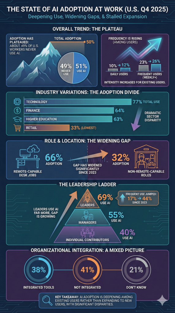
I’ve been following the trends with AI for some time and Gallup recently released new data (January 26, 2026) on AI use in the workplace. This page summarizes the Gallup report “Frequent Use of AI in the Workplace Continued to Rise in Q4”. I post this information as a convenient place for my reference. It might be of interest to others too.
Where to put “content” and where to “demo” functionality!
Recently, I’ve been looking more into posting on LinkedIn and Medium. In addition to my personal blog, I wanted a place to highlight my interests and what I’m working on. I’ve used knowledge management and sharing tools like Confluence, SharePoint and OneNote to post my thoughts on work related topics on “intranets” in places where I’ve worked.
Now, I’d like to post more online so I can find information quickly and share with others. As part of this I’m using this blog, my LinkedIn space and Medium as places to post and share.
The idea is to expand on my writing and capture more “online” than in OneNote. I’m also looking at Notion.ai which may be where I end up putting more “content” this year.
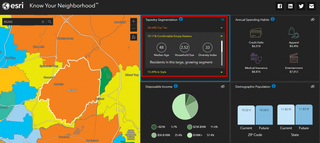
For the last 20 years, ESRI has been capturing geographic and demographic data. In the 90’s Acxiom (and others) came up with Lifestyle Segmentation. ESRI started in 1969 and today maps “everything” down to the household level.
I’m surprised by the accuracy of Tapestry Segmentation. The top three segments in my zip code are: “Top Tier”, “Comfortable Empty Nesters” and “In Style”. Pretty accurate – with one data point. I’m an Empty Nester who would like to be “In Style” or “Top Tier” but feel very lucky and fortunate to be “comfortable”.
Differential privacy seeks to protect individual data values by adding statistical “noise” to the analysis process. The math involved in adding the noise is complex, but the principle is fairly intuitive – the noise ensures that data aggregations stay statistically consistent with the actual data values allowing for some random variation, but make it impossible to work out the individual values from the aggregated data. In addition, the noise is different for each analysis, so the results are non-deterministic – in other words, two analyses that perform the same aggregation may produce slightly different results.
Recently I decided to move from AWS to Azure for the hosting of my “Sandbox” sites. With the move, I plan to add serve up live interactive data content highlighting different “data” projects of personal and professional interest.
Much of what I’ve worked on is contained on “corporate” portals and intranets. The move to Azure from AWS for “server based” content will allow more flexibility and access to Power BI, SharePoint and Microsoft Teams.
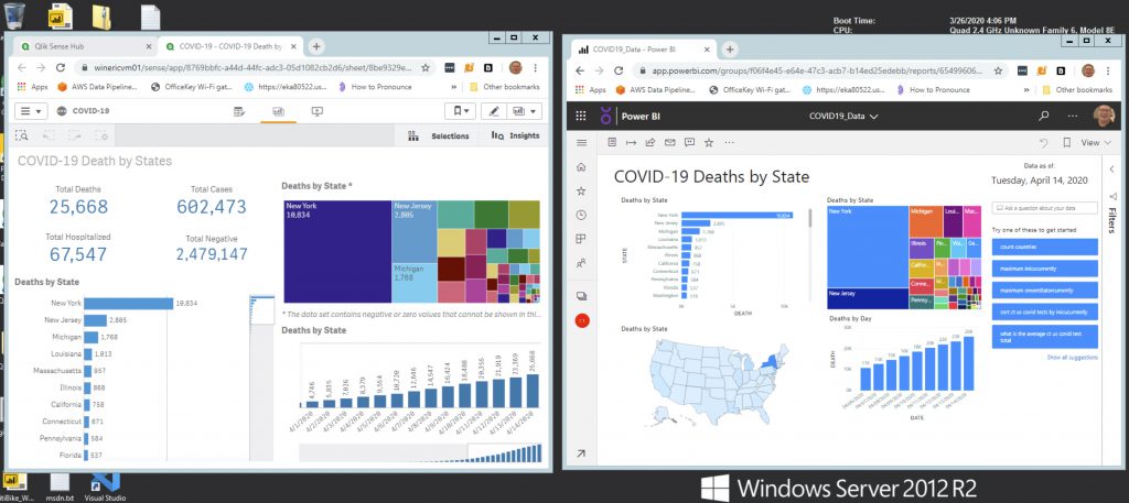
A took a quick look at the COVID-19 data using Power BI and Qlik Sense. Both have their advantages – but are using the same dataset. A shared table in Snowflake (CT_US_COVID_TESTS).
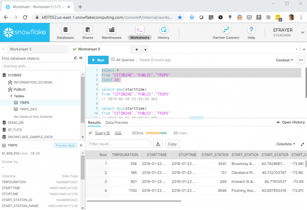
Yesterday I attended a free workshop put on by Snowflake. The session entitled “Zero to Snowflake in 90 Minutes” provided information on Snowflake’s Architecture, Performance and Scalability as well as a “hands-on” demo. Snowflake touts itself as “The Data Warehouse Built for the Cloud” and is gaining enterprise customers at a dizzying pace.
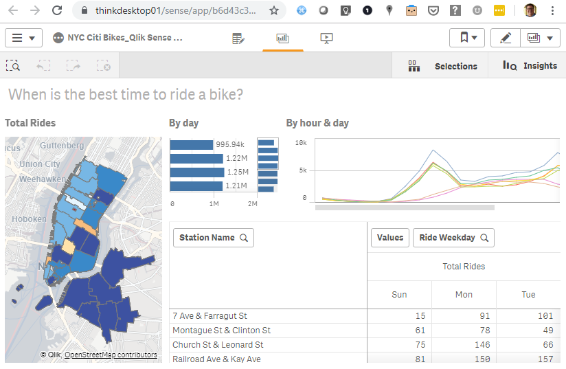
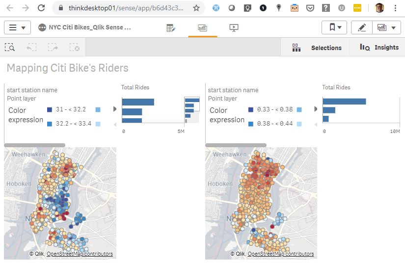
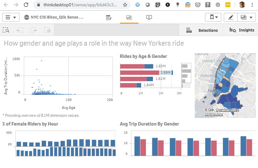
The “demo” used data from Citi Bike – New York City’s bike share system. Citi Bike is the nations largest bike sharing service. The data can be downloaded from: https://www.citibikenyc.com/system-data
The workshop provides an introduction to how to setup and use Snowflake. The outline is below and the lab takes 90~ minutes:
Lab Overview Module 1: Prepare Your Lab Environment Module 2: The Snowflake User Interface & Lab “Story” Module 3: Preparing to Load Data Module 4: Loading Data Module 5: Analytical Queries, Results Cache, Cloning Module 6: Working With Semi-Structured Data, Views, JOIN Module 7: Using Time Travel Module 8: Roles Based Access Controls and Account Admin Module 9: Data Sharing
I found the workshop very interesting and for two reasons. First, it covered all the basics of using a cloud based database. Users loaded data from a S3 bucket, parsing both csv and json files. Queried the database and managed schema’s and security. The second reason why enjoyed the session is because Qlik’s Elif Tutuk used this dataset for a Qlik Sense Demo app.
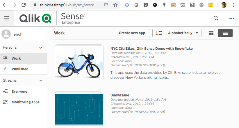
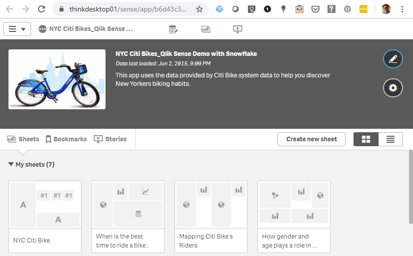
I found a copy of the old Qlik Demo app and set it up on a Qlik Sense instance.
I created a ODBC connection (using a DSN) and was able to update the data from Snowflake. The combination of Qlik Sense and Snowflake is compelling. I liked the Snowflake demo especially when I could match it up with the visualizations from Qlik Sense.