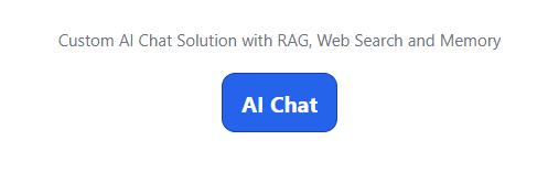
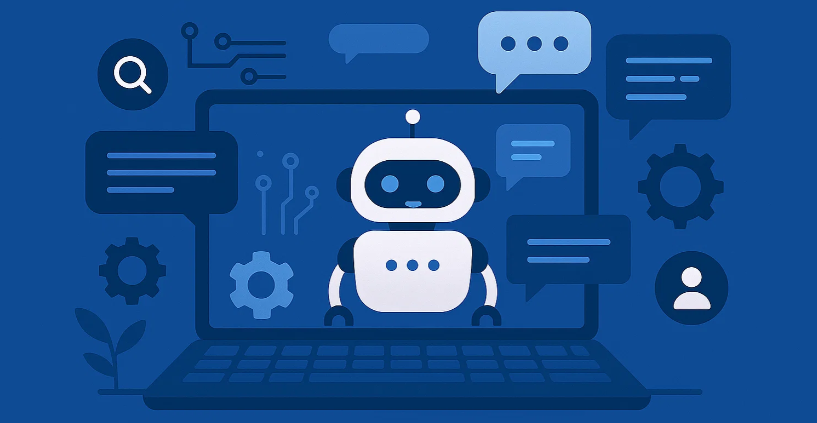
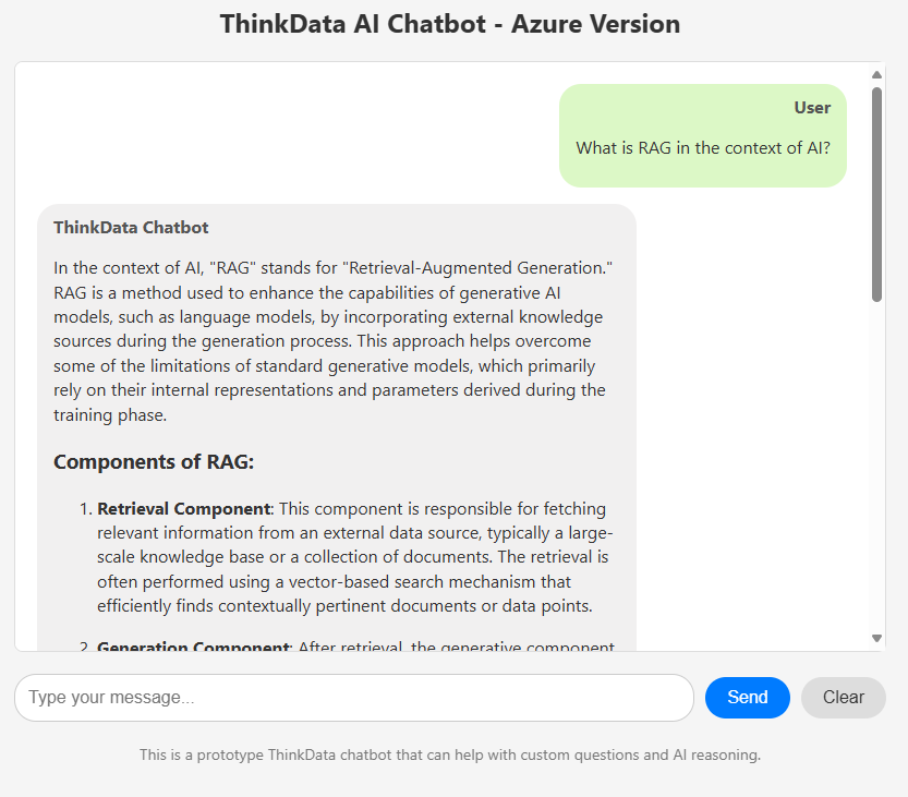
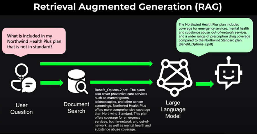
I’ve updated my Custom AI Chat solution and have shared the technical details on Medium. The exercise allowed me to understand better the tradeoffs from building my own RAG based solution – and using a combination of Open AI APIs and Web Search to help with a custom solution.
Open AI releases GPT-5 so it’s time for updates and new functionality to my custom chatbot!
Several months ago, I shared an update regarding my work on a custom AI chatbot. My primary objective was to explore the capabilities of the OpenAI APIs and deepen my understanding of ChatGPT’s functionality.
With the release of GPT-5, I thought I could update my custom AI Chatbot and introduced a couple of new features. More details are available on my Medium page!
I’m currently studying to take a couple of Microsoft Certifications. I’m using Cloud, BI, Data and Analytics technologies all the time but with my current work break, it seems like the perfect time to schedule a couple of Microsoft certification tests.
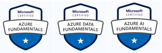
Update: I’ve passed the three certs mentioned: Azure Cloud, Data and AI Fundamentals.
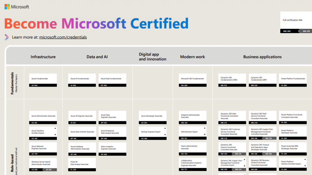
In thinking about what to take and how to study, I went to learn.microsoft.com and came across an interactive PDF (see below). I liked that the pdf is interactive – in a browser it will take you to just what is needed for more info! Hover over the image and try the link for more! (Note: click once to pull up the PDF in your browser and then make a second selection to go right to that location on learn.microsoft.com.
Click on image for downloadable PDF!
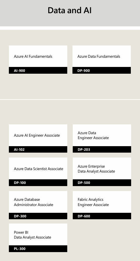
I ended up thinking I should take the fundamentals Cloud, Data and AI and maybe the latest Power BI exam. My Power BI certification expired in 2020 and PBI is updated monthly so it might be time to take it again.
I asked Perplexity.ai to help me summarize the 4 exams for this page. The results are below and pretty good (I think), I especially liked the “citations” feature of Preplexity.ai – great for research!
AZ-900: Azure Cloud Fundamentals
The AZ-900: Microsoft Azure Fundamentals exam is designed for individuals aiming to showcase a basic understanding of cloud services and how Microsoft Azure delivers them. It covers a broad range of topics including cloud concepts, core Azure services, security, privacy, compliance, and trust, as well as Azure pricing and support. Candidates for this exam should have a foundational knowledge of cloud services and how those services are provided with Microsoft Azure. The exam format includes multiple-choice and multi-response questions, and it typically consists of 40-60 questions to be completed in 60 minutes. A passing score is 700 out of 1000.
DP-900: Azure Data Fundamentals
The DP-900: Microsoft Azure Data Fundamentals exam is an opportunity to demonstrate knowledge of core data concepts and related Microsoft Azure data services. This exam is intended for candidates beginning to work with data in the cloud. It covers topics such as core data concepts, working with relational and non-relational data on Azure, and an analytics workload on Azure. The exam format includes 40-60 questions, and the duration is 65 minutes. A passing score is 700 out of 1000. Candidates should be familiar with the concepts of relational and non-relational data, and different types of data workloads such as transactional or analytical.
AI – 900: Azure AI Fundamentals
The AI-900: Microsoft Azure AI Fundamentals exam is designed for candidates having basic and foundational knowledge in the field of machine learning (ML), artificial intelligence (AI) concepts, and related Microsoft Azure services. This exam covers topics such as AI workloads and considerations, fundamental principles of machine learning on Azure, features of computer vision workloads on Azure, and Natural Language Processing (NLP) workloads on Azure. The exam format includes 40-60 questions, and the duration is 65 minutes. A passing score is 700 out of 1000. It is an opportunity for candidates to demonstrate their knowledge of common ML and AI workloads and how to implement them on Azure.
PL-300: Power BI
The PL-300: Microsoft Power BI Data Analyst exam measures your ability to identify business requirements, clean and transform data, build data models, deliver actionable insights, enable others to perform self-service analytics, and deploy solutions for consumption using Power BI. The exam focuses on evaluating the candidate’s skills in designing and implementing data models, creating and managing reports and dashboards, and securing data in Power BI. The exam format includes 40 to 60 questions in different formats such as multiple-choice, true/false, drag and drop, list builds, and case studies, to be completed in 100 minutes. A passing score is 700 out of 1000. I passed this in 2021 so time to take it again!
Update: I passed this exam in June 2025!
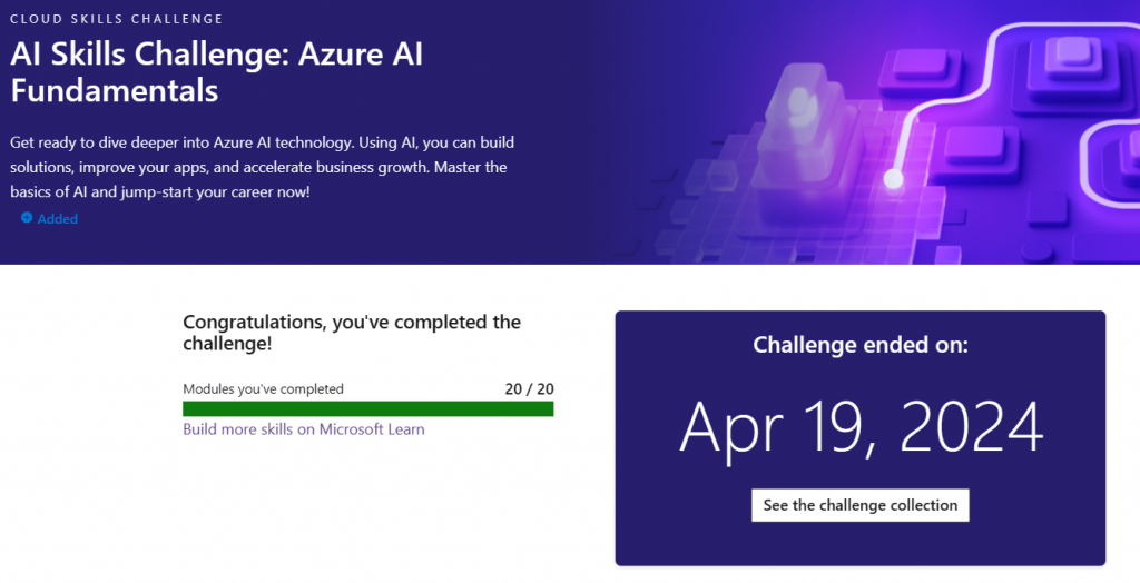
Microsoft Challenges provide free vouchers for Certification Exams!
Completing a Challenge earns a free voucher for the exam!
Completing a Challenge earns a free voucher for the exam!
Completing a Challenge earns a free voucher for the exam!
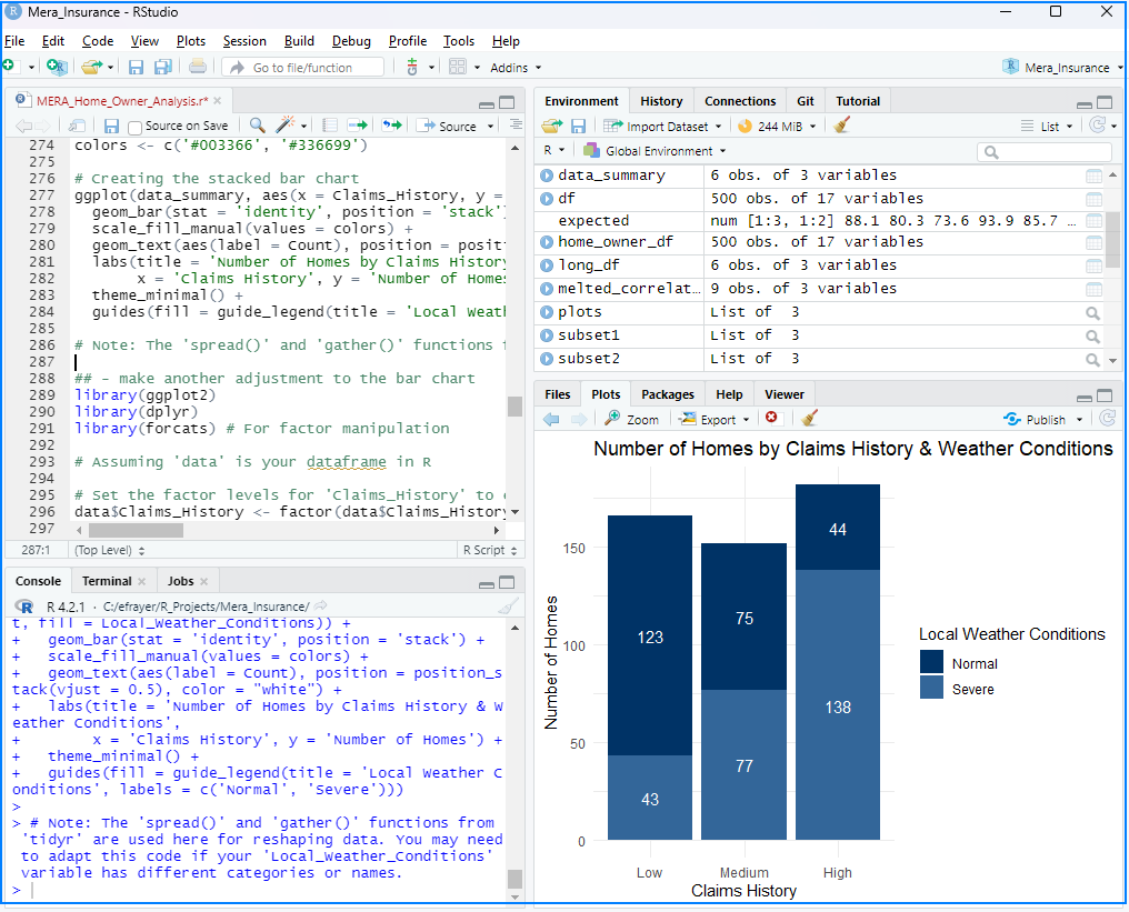
Over the last couple of years, I’ve created visualizations using R, Python, Power BI, Tableau and Qlik. Here are a couple of places where I’ve put these examples.
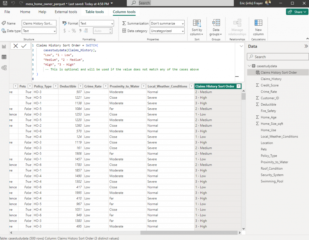
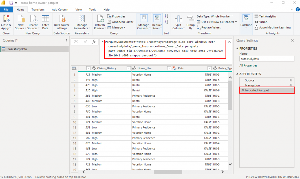
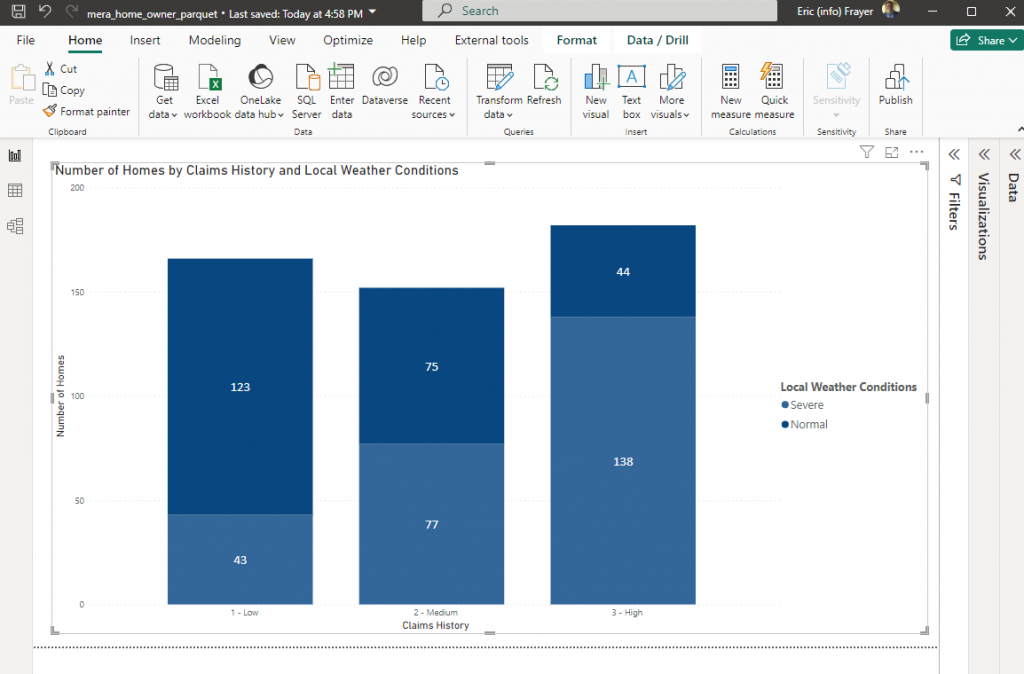
Power BI – Using the same dataset only loaded from a parquet format (ADSL Gen2) into Power BI the same visualization can be created.
Data Loaded from Parquet file in Data LakeTransform Data – Power Query – Data Load of Home Owner Parquet File
With the data has been loaded into Power BI a simple bar chart visualization can be created.
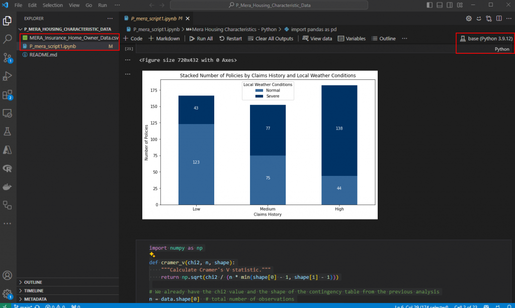
Python – Of course, this same dataset can be loaded into Python as a csv and using Visual Studio Code yet another visualization can be created.
Final version – Bar chart showing relationship between Claims History and Local Weather Conditions
It should be noted, GPT-4 helped with the code and also creating a “statistically significant” relationship in the data with the Local Weather Conditions (either normal or severe) adversely impacting Claims History.
Last year, I read a very interesting blog post by Darwin Schweitzer a Microsoft technologist who discusses how to consider emerging technologies in the context of building sustainable enterprises. The blog posts relates the learning patterns organization adopt to newer data technologies replacing existing capability. The approach covers the strategic, organizational, architectural and technological challenges and changes with scaling enterprise analytics.
Three Horizon Model/Framework – strategic Data Mesh Sociotechnical Paradigm – organizational Data Lakehouse Architecture – architectural Azure Cloud Scale Analytics Platform – technological
Microsoft Viva is an employee experience platform that brings together communications, knowledge, learning, resources, and insights in the flow of work. Powered by Microsoft 365 and experienced through Microsoft Teams, Viva fosters a culture that empowers people and teams to be their best from anywhere.